Batch-Process Daily Manifests into
One Carrier Cost Comparison Spreadsheet
An analysis by EasyPost of parcel shipping spend found that shippers who compare carriers on base rates alone overpay by around 6% on average — on a $10 million annual parcel budget, that's roughly $600,000 a year (EasyPost). The missing ingredient isn't a better rate calculator. It's the actual per-shipment cost data — weight, dimensions, zone, service, surcharges — that sits unread in the shipping manifests your operation produces at the end of every day.
Key Takeaways
- A 6% overpayment on a $10M parcel budget is $600,000 a year — and it hides in surcharges, zone spreads, and dimensional weight that base-rate comparisons never capture.
- Your daily shipping manifests already record every weight, zone, and surcharge — but manual transcription at 40 documents a day guarantees one silently corrupted row per business day.
- Define the columns you need once, drop in 40 multi-carrier manifests, and one aligned spreadsheet comes out in minutes — no per-carrier templates or transcription of a single cell required.
The Daily Manifest Pile Is Where Shipping Cost Data Actually Lives
A shipping manifest is the list of every item in a shipment — quantities, weights, package counts, sender and receiver, origin and destination, handling notes, and tracking numbers (Extensiv). Carriers like UPS, FedEx, and the USPS require some form of end-of-day close-out — a manifest or SCAN form that summarizes everything a shipper handed over that day. It exists so the carrier can reconcile pickup, verify contents, and clear the shipment through its network.
That means the manifest is the one document that records what actually shipped, on the day it shipped, in the carrier's own units: the exact billable weight entered, the box dimensions, the service tier, the zone it's traveling to. The carrier's invoice arrives weeks later and tells you what it cost — but by then, the ability to check one zone, one weight band, or one service against another is buried under a pile of unread close-out paperwork. This is the blind spot most shipping cost discussions never reach: the data you need for a carrier comparison already exists, generated daily, in a format nobody reads back.
The same documents that close out your day with the carrier are the ones that could tell you, by Friday, exactly how much each carrier, zone, and service tier actually cost you — if the data ever made it into a spreadsheet.
What a Shipping Manifest Actually Records
Before building a comparison spreadsheet, it helps to know exactly what's on the documents you're working with. A manifest is not an invoice and not a bill of lading. It's an operational record, and its fields map directly to the columns a cost comparison needs:
- Shipment identity. Tracking numbers, manifest or close-out numbers, and shipment date — the row keys that tie a manifest to a carrier invoice later.
- Package facts. Item descriptions, quantities, package counts, actual weight, and dimensions. These are the inputs to dimensional (DIM) weight — the number that often decides what you're billed.
- Routing. Origin and destination ZIP codes (which determine the zone), carrier, and the service tier used (Ground, Priority, 2nd Day Air, and so on).
- Handling notes. Residential delivery, extended area, signature requirements — each of which triggers a surcharge on the invoice.
The distinction between a manifest and a bill of lading matters for choosing the right workflow. A bill of lading is a contract of carriage for one shipment, usually in ocean or intermodal freight; a manifest is an administrative summary that may cover many shipments at once. If your operation moves freight on bills of lading rather than parcel manifests, batch-processing BOLs across ocean carriers is a different workflow with its own field set. This article covers the parcel world — the daily stack of manifests that e-commerce and small fulfillment operations actually touch.
The reason this record is so valuable for cost analysis is its timing. The manifest captures the shipment facts on the day they happen; the invoice prices them three to six weeks later. If you only ever look at invoices, you can see what you paid but not which decisions caused it. The manifest is the daily accumulation — the part you can still act on before the money is gone.
What a Carrier Cost Comparison Spreadsheet Needs (Column by Column)
The classic mistake is comparing carriers on sticker rates. A rate is only meaningful once you add the surcharges that turn a base rate into the fully-loaded cost — and that's where most comparisons quietly fail. For an e-commerce shipper, the residential surcharge alone adds roughly $6.45–$6.50 per package on UPS and FedEx ground; at 1,000 shipments a month to home addresses, that's over $6,400 in monthly cost that never appears in the headline rate (GoBolt). Fuel surcharges are even more volatile: as of the week of August 10, 2026, UPS Ground fuel sat at 27.00% and FedEx Ground at 26.25%, both up from roughly 22.5% a year earlier (SpeedCommerce).
So the spreadsheet needs columns for every cost driver, not just the rate you saw at checkout:
| Column | Why it belongs in the comparison |
|---|---|
| Ship date & tracking number | Row keys — join this sheet to carrier invoices at month-end without guesswork. |
| Carrier & service tier | The two axes every comparison pivots on (UPS Ground vs. FedEx Ground vs. USPS Ground Advantage). |
| Zone | Cost varies more by zone than by carrier: USPS prices swing ~107% from zone 2 to zone 8, UPS ~65% (SpeedCommerce). |
| Actual weight & dimensions | The raw inputs carriers use to compute dimensional weight. |
| Billable weight | The larger of actual vs. DIM weight — the number you're actually billed on. |
| Base rate | The published or contracted rate for the lane and service. |
| Fuel surcharge | ~26–27% of base on UPS/FedEx ground in mid-2026, reset weekly. |
| Residential / DAS / other surcharges | $6.45–6.50 residential, plus rural delivery-area and address-correction fees. |
| Total cost | Base + every surcharge — the number that actually leaves your bank account. |
There's also a 2026 rule change that makes this spreadsheet more urgent than it was last year. On July 12, 2026, the USPS cut its dimensional weight divisor from 166 to 139, matching UPS and FedEx, and started rounding every fractional dimension up to the next whole inch (Supply Chain Dive). A 14×12×11-inch box with 3 lb of actual weight was billed at 12 lb under the old rules; the same box is billed at 14 lb today — 1,848 cubic inches ÷ 139 instead of ÷ 166 (DCL Logistics). Lightweight, bulky products just got roughly 19% more expensive to ship via USPS overnight, and the only way to see which of your SKUs are affected is to track actual billable weights over time. A spreadsheet with these columns is exactly the tool that makes that visible.
Why Building This Spreadsheet by Hand Fails at 40 Manifests a Day
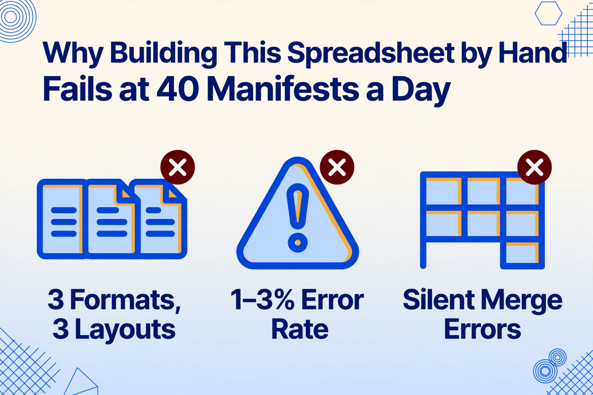
None of this is controversial — most logistics people know they should track carrier costs. The reason they don't is that building the sheet by hand is a daily transcription job, and transcription fails at batch scale in three specific ways.
1. Format fragmentation. A USPS end-of-day SCAN form, a UPS electronic manifest export, and a FedEx invoice PDF each arrive in a different shape — different field names, different column order, different units (ounces vs. pounds, inches vs. centimeters). Hand-copying data across three layouts invites exactly the errors that destroy a cost comparison: a weight read from the wrong column, a zone mis-transcribed, a surcharge dropped.
2. Human error rate. Manual data entry error rates average 1% to 3% under normal conditions — and a single transposed digit in a tracking number silently severs that row from its invoice forever. At 40 manifests a day, a 2% error rate means roughly a bad row every working day. None of them announce themselves.
3. The merge step. Even with every field copied correctly, you still have to assemble 40 rows into one aligned table — and the merge is where the quiet mistakes hide: a row shifted by one cell, a column pasted under the wrong header, a Friday's data that never made it in. One misaligned row quietly corrupts every pivot you build on top of it.
A single manifest takes minutes to transcribe by hand. Forty a day, across three carrier formats, stop being a typing problem and become an integrity problem — and no amount of careful typing fixes that.
The Batch Workflow: One Column Definition, One Comparison Table
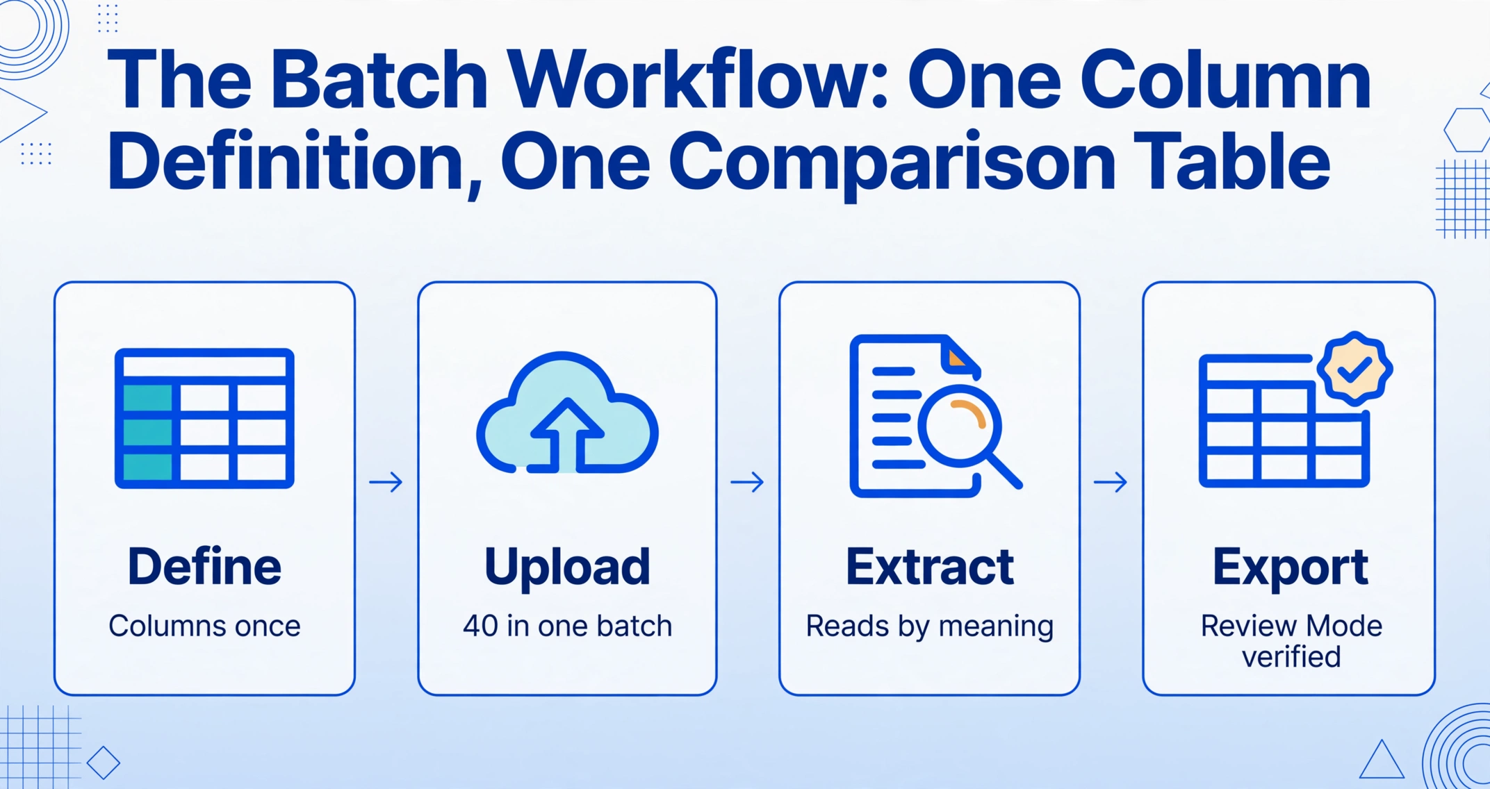
The fix isn't a faster typist. It's a workflow where the documents themselves are the input, and the aligned spreadsheet is the output — with no transcription step in between to drift. This is what Custom Column Extraction does: you type the column names you want — "Tracking Number", "Carrier", "Service", "Zone", "Billable Weight", "Total Cost" — and the AI locates each value on every manifest by understanding what the field means, not where it sits on the page. The column names you enter become the headers of the final spreadsheet, so the comparison table is correct by construction.
Because the column definition stays the same for every carrier, the format-fragmentation problem dissolves: a USPS SCAN form, a UPS export, and a FedEx PDF flow through the same batch and land in the same table — no per-carrier templates to build or maintain when a carrier redesigns its paperwork. The merge problem never arises, because one batch produces one table. And the error problem shrinks to what you can see: Review Mode highlights exactly where on the original manifest each extracted value came from, so you spot-check the risky rows instead of re-reading all 40 documents.
Files are processed securely and not stored.
If your manifests arrive as individual package labels rather than consolidated end-of-day summaries — for example, when customers or remote teams ship directly and forward the labels — extracting shipping label data per package follows the same column-defined workflow, just on a different document shape.
What the Comparison Sheet Tells You (That Invoices Never Will)
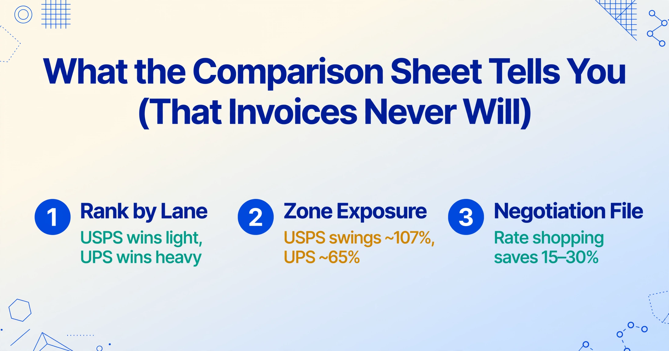
Once the daily rows accumulate for a week or two, the comparison table starts answering questions that used to require a spreadsheet consultant. Three analyses deliver most of the value.
Rank carriers by lane and service. A pivot table with Carrier × Service as rows and average Total Cost as values shows where each carrier actually wins. USPS tends to dominate light, small packages; UPS and FedEx get competitive past certain weight bands; the zone spread means the winner changes by destination. The honest answer to "which carrier is cheapest" is almost always "it depends on your lane, weight, and box" — and now you can see exactly which lanes favor whom.
See your zone exposure. Because USPS pricing swings ~107% from zone 2 to zone 8 while UPS swings ~65%, a customer distribution weighted toward far zones changes which carrier is cheapest overall. Grouping Total Cost by zone shows whether your delivery geography is quietly shifting your shipping costs — and whether a second fulfillment location or zone skipping would pay for itself.
Build a negotiation file. The single highest-ROI change in parcel shipping is multi-carrier rate shopping, which routinely saves 15–30% of shipping spend without changing service levels (GoBolt). But you can't negotiate with "I feel like FedEx is expensive" — you can negotiate with "1,240 packages to zone 6 last quarter, 63% residential, average billable weight 4.2 lb." That file is what this spreadsheet becomes after a month of daily batches.
The same extracted rows double as the reconciliation layer at month-end: joining manifest data to carrier invoices — the process covered in depth in batch-processing freight invoices into a carrier cost report — turns "the invoice looks high" into "the invoice doesn't match what shipped." Manifest data is the reference table that makes that comparison possible.
What Batch Extraction Won't Do (and What Handles That)
Being clear about the boundary saves you from expecting the wrong tool to do a different job. Extraction reads the manifests you already have — it produces the actual, shipped, as-billed reality of your operation. It is not a live rate shopping engine, and pretending otherwise will disappoint you.
Extraction gives you what was shipped, not what you could have paid. Deciding which carrier to use before you ship is a rate-shopping problem, handled by multi-carrier shipping platforms and their carrier APIs — ShipStation, Shippo, EasyPost, and Pirate Ship all compare live rates across USPS, UPS, and FedEx at checkout time. That's a complement, not a competitor: rate shopping optimizes the next shipment; the manifest spreadsheet optimizes the whole account.
Fuel surcharges reset weekly. The 26–27% figures above were the ground rates for the week of August 10, 2026. If you model carrier costs, pull the current week's surcharge tables first — a comparison built on last month's fuel number is already stale. Your spreadsheet should record actual surcharges from the documents, not assume today's rates persist.
Printed data extracts at high accuracy; handwriting needs a spot check. Printed manifest fields are recognized with up to 99% accuracy on typical table data. Handwritten weights or dimensions on paper manifests are read too, but those rows deserve the Review Mode pass — that's what the highlight-to-source verification is for. If you're evaluating which extraction approach fits the rest of your logistics stack, the 2026 guide to document extraction tools for logistics compares the options by workload.
FAQ
Can this compare live rates from multiple carriers?
No — and that's deliberate. Batch extraction reads the manifests you already have and gives you the actual shipped and billed data: real weights, real zones, real surcharges. Comparing live rates before you ship is a rate-shopping job for carrier APIs (ShipStation, Shippo, EasyPost, Pirate Ship all do this). The two work together: rate shopping optimizes the next shipment, the manifest spreadsheet optimizes your account over time.
Does it work with USPS SCAN forms and end-of-day manifests?
Yes. USPS SCAN forms (Shipment Confirmation Acceptance Notice), UPS electronic manifest exports, FedEx close-out summaries, and paper manifests all flow through the same batch. You define your columns once and the AI reads each carrier's layout by meaning — there's no pre-sorting by format, and no template to create per carrier.
Do I need to build a template for each carrier's manifest format?
No. Template-based extraction tools require a separate template for each carrier's layout, and those templates break silently when a carrier redesigns its paperwork. Custom Column Extraction works from the column names you define — the AI locates "Billable Weight" or "Zone" on any carrier's document by understanding what the field means. A carrier format change doesn't break your workflow.
How accurate is extraction on handwritten manifests?
Printed manifest fields are recognized with up to 99% accuracy on typical table data. Handwriting is also read, but accuracy varies with legibility — so hand-written weights and dimensions are the rows to spot-check in Review Mode, where hovering a cell highlights where the value came from on the original scan. The verification layer keeps the check to minutes, not a re-read of the whole pile.
How do I trace a row back to its shipment if filenames are just "Scan_0042.pdf"?
Include "Tracking Number" (and carrier and ship date) as extraction columns. Tracking numbers are pulled from the document itself and appear in the output row, so traceability never depends on filenames. When a row looks wrong, you can open the source manifest in seconds instead of hunting through a folder.
The Manifest Stops Being Paperwork and Starts Being a Decision
There's a quiet shift when a shipping operation stops transcribing manifests and starts batch-processing them. The two hours a day that used to vanish into copy-paste reappear as something else: the Friday review where you see that zone 7 packages are running 30% above the account average, the negotiation file that turns a vague "we'd like a better rate" into a per-lane volume claim, the month-end reconciliation that catches a $900 surcharge discrepancy before it clears. The typing was never the job. Understanding what you actually paid to ship — and why — was, and it only becomes possible once the daily manifests become rows in a table.
One batch, one spreadsheet, every weight and zone and surcharge in place — that's what makes carrier cost comparison a weekly habit instead of a quarterly surprise. Upload a day's worth of your actual manifests and watch 40 documents become one cost comparison table in a single pass.